

As I mentioned on Tuesday, I have a friend in town this this week, so I haven’t been focusing on work these last of days. But that hasn’t stopped me from thinking about my projects, and it hasn’t stopped us from talking about the options. And my mom and I have come to a (very friendly) battle of wills over my walk-in closet island. 😀
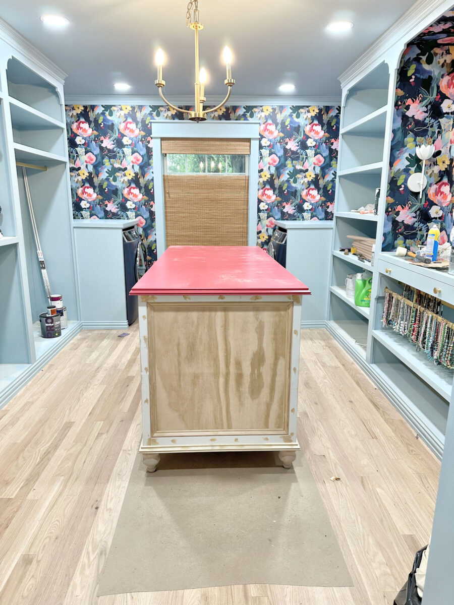
When I said I wanted to paint it an accent color, I’m sure most of you knew that the color I wanted is pink. I didn’t know which pink, though. And the only pink I had on hand was a very dark reddish pink. But that’s the one I tried just to see what a pink (or pink-ish) island would look like in the room. For the record, I know for sure that this isn’t the one I would choose, so I’m not looking for input on this particular color.
But that color at least gave me an idea of what an accent color would look like on the island. And I love the idea! So I went back to this post where I shared various colors that I pulled from the wallpaper and tried out on the island, and I decided that this one is the one I liked the most.
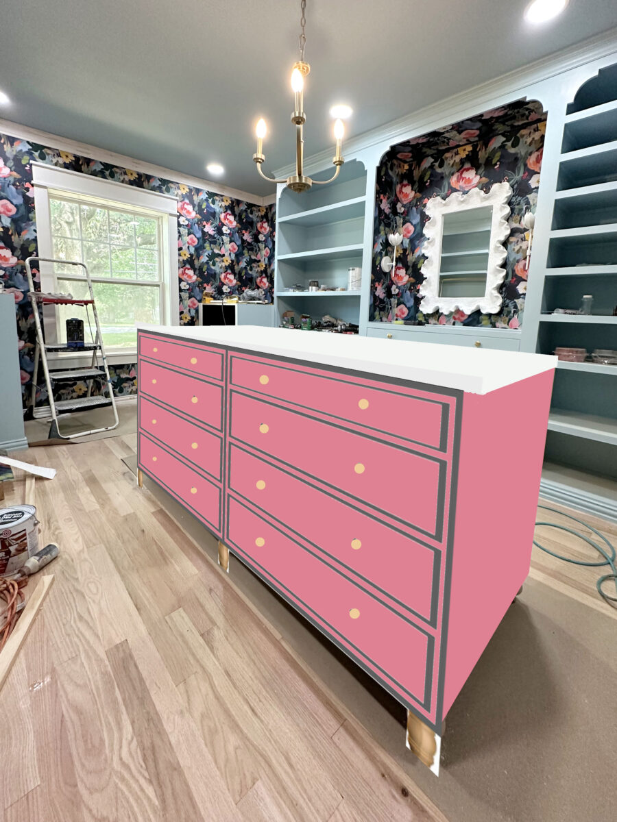
But I also really love the white countertop in that mockup. So I’ve decided that regardless of the color I paint the base, I’m definitely going back to having a white top. I like the lightness and brightness it adds to the room.
So that brings me back to the base color. I love the pink, but my mom hates it. Now those of you who have been around a while know that my mom has a very artistic eye. She is an artist, and while she and I have very different decorating styles, I do trust her artistic eye. And because I know she has an artistic eye, and I trust that she understands scale, balance, etc., I tend to listen when she gives me input. That doesn’t mean that I let her decorate my house. 😀 But I do value her opinion and give her opinions and input some weight in my decisions.
But y’all, we definitely do not agree on this island. When I say that she hates the idea of a pink island, I mean that she is vehemently opposed to a pink island. Don’t worry…we laugh and have a good time when we talk about it. And she knows it’s my house and I’ll make my own decision, but she hates the idea of a pink island.
So yesterday, as my mom, my friend Lori, and I were talking about the island color, my mom randomly said, “I think you should paint it in stripes with lots of colors pulled from the wallpaper.”
What? Stripes? I mean, I LOVE stripes. Flowers and stripes are my favorites. I’d put stripes and flowers on everything if I could get away with it! But I totally thought she was kidding. I thought she was poking fun at me and my love of lots and lots of colors.
But she wasn’t kidding. Her thought is that if I paint the island in a solid accent color, the island, and not the wallpaper, will be the thing that draws the eye. It will become the focal point. It will basically be the only thing that people see when they look at the room. But if I paint those end panels in stripes using lots of colors from the wallpaper, the two will complement each other and keep the wallpaper as the focal point.
I should have made her do the mock up of her idea because (1) only she can see what’s in her mind, (2) she’s much better at Photoshop than I am, and (3) this is HER idea. We didn’t even talk about the details. Would the stripes all be the same width? Would they be arranged in an ombre order, or just random? We didn’t even get that far in our discussion.
So I have no idea if this is what she’s actually envisioning, but I did do a little mockup of stripes last night after they left my house.
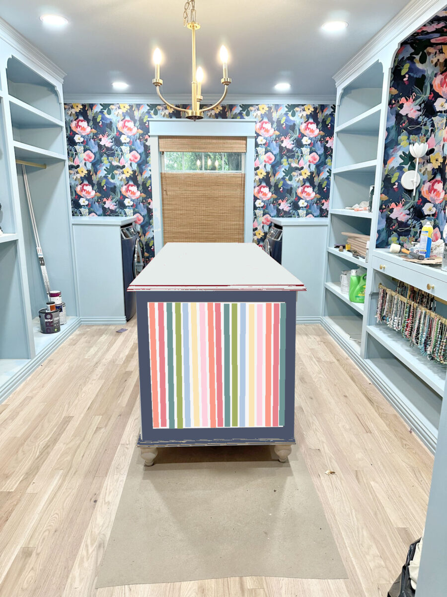
If I do stripes in those panels on the ends, the only color I can imagine the rest of the island being painted is the dark blue from the background of the wallpaper. Any other color would be wrong to my eye.
I’ve resisted the idea of doing dark blue on the island, but my issue with it was that I didn’t want the dark blue being that close to the doorway because there will be dark teal grasscloth just outside this room on the foyer walls. But I got the roll of wallpaper and put it against the wallpaper and dryer.
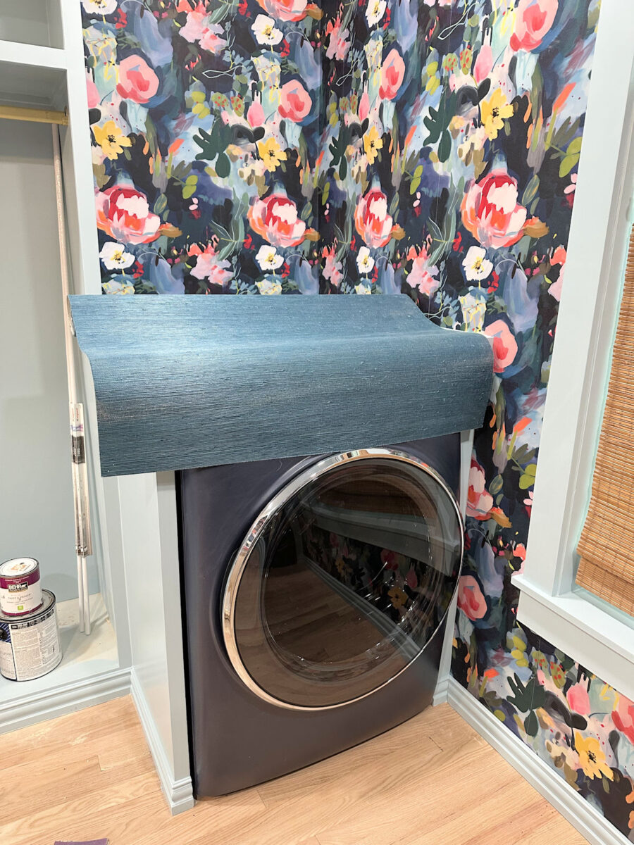
It actualy doesn’t look bad! I mean, I don’t want a big blob of dark blue that close to the grasscloth. In other words, I don’t want to paint the island a solid dark blue. But if I do stripes on those end panels, the dark blue will only be on the frame around the stripes. I can live with that.
So here we are. A battle of wills. Mother vs. daughter. Solid pink vs. dark blue with stripes on the end panels.
Who will win? I’m not sure at this point. Honestly, since we’re talking about stripes, I kind of think I win either way. But stripes aren’t even a thing I had considered until yesterday when she brought it up. I do think it’s an intriguing idea, but it’s a completely different look from what I had been envisioning all along.
The only thing I know for sure at this point is that the island will not be light blue. I just can’t do any more light blue in here. I need color, variation, and something different on the island.
My friend leaves this afternoon, and I’ll be getting back to work after she leaves. So hopefully by Monday, we’ll know who won this (very friendly) battle of wills. 😀

Addicted 2 Decorating is where I share my DIY and decorating journey as I remodel and decorate the 1948 fixer upper that my husband, Matt, and I bought in 2013. Matt has M.S. and is unable to do physical work, so I do the majority of the work on the house by myself. You can learn more about me here.